Landscape
noun
landscape
noun
landscape
All the visible features of an area of land, often considered in terms of their aesthetic appeal.
"the soft colours of the Northumbrian landscape"- a picture representing an area of countryside.
- the genre of landscape painting.
- the distinctive features of a sphere of activity.
- A format of printed matter or screen display that is wider than it is high.


When I hear the word landscape I think of a landscape photograph of scenery of the nature or a city.
A list of words to with landscape are: Cityscape, Nature, Contrast, Saturation, Terrain, Mountains, Sunset, Art, Photographs, Rule of thirds, Scenery, Geography, World, Camera, Sky, Land, Architecture, Garden, Earth, Backdrop, Foreground.
When I google landscape I can see photos of mountains, lakes, roads and sunsets.
My ideal landscape photo is a photograph up in the mountains, with a bright red sunset and mountains covered in trees in the distance and buildings further behind it, with a path leading downwards towards the end of it.
The landscape I can see out of my window is my street and the cars on it, the houses opposite the road and all the people that walk by.
Comparing Landscape Photographs

Roger Fenton - The Valley Of The Shadow Of Death 1885
|

Richard Prince - Untitled (Cowboy) 1989
|
In the first picture I can see a dirt road leading of into the distant; as well as the left overs of a war with lots of cannon balls lying around. This photo shows the loneliness of the area and how deserted it is with the use of only using grey colours, which also gives an idea of when the photo was taken.
In the second photo I can see a cowboy riding a horse against a blue background. The use of the high saturation helps to make the photo stand out and make it more appealing to look at whilst also making the cowboy the main feature of the photo with the use of the contrast between the dark clothing and horse and the bright blue sky and clouds.
The main similarities between these two photos are how the photos look empty inside with just on focus point of the photo, but how they both make you stare at the photo to find out what is happening inside. Furthermore, they both use rule of thirds as in the first photo the dirt hill covers up most of the photo as well as the sky above it taking a third of the photo. The second photo uses a third of the photo on the foreground of the dirt ground and the sky taking up the other parts of the photo.
The main difference between the photos are the use of colour. For example, the first photo uses dark, monochrome tones inside the photo making all the dirt and paths stand out against the bright sky. Whereas the second photo uses bright, saturated colours to make the cowboy stand out against the blue sky and uses very contrasting colours.
The detail the strikes me the most in the first photo are all the cannon balls lying around on the paths, implying how it used to be used in the past. Furthermore, I know he placed the canon balls there as the photo is part of an album, showing the same photo without cannonballs; implying how he purposely placed cannonballs in the landscape to represent the past wars and battles fought there. In the second photo, the detail the strikes me the most is the horse running at high speeds as the sand gets kicked away. This implies that he might be chasing something.
I personally think that the photo on the left would be a more accurate source of evidence as it shows the aftermath of what has happened during that time and shows what happened to the area. It also gives a wider view of the area, telling more information the viewer.
Tanja Deman


In these photos i can see a theatre or stadium with lots of seats surrounding something surreal that everyone is watching. All of the photos are in grey scale, I think they have done this to make the centre of the photo stand out whilst making the photo more interesting the more you look at it, noticing how there are lots people sitting down or how the lights are shining down on the object. These photos are a digital collage; mixing a stadium with a surreal landscape, making it seem as if it's suppose to be there. The use of the lighting pointing towards the centre of the photo makes you eyes focus on the object of the photo as it's brighter than the surroundings. The fog gives a sense of mystery around the mountain in the middle photo and makes you curious about what is happening inside it and how it's been made. Tanja Deman has made these photos by taking a photograph of a stadium or theatre with an audience watching something, then using digital software to put a geographical location into the photo; making it seem as if everyone has their attention set on the nature. This makes your attention focus on naturistic elements as you follow the leading lines pointing towards it and also the direction the audience is looking at. The use of the digital collage makes the photographs stand out as rather than a regular photo, she incorporates a regular photograph with a photograph of an element in nature, making it stand out more as It's unnatural to look at making the viewer stare at it, trying to figure out what's happening inside of the photograph
My response


We then made collages using inspiration from Tanja Deman, I used a landscape photo of some hills, mountains and trees and combined it with a landscape of the city. I first cut out the city using a scalpel and then cut out the mountains and layered it on top of each other. I was happy with this collage because it looks like the city is peeking out of frame and its in the middle of the mountains.
After finishing the collages we turned it into acetates using the photo copier and used the acetates to makes positive and negatives in the dark room.
After finishing the collages we turned it into acetates using the photo copier and used the acetates to makes positive and negatives in the dark room.


Dark Room Experiments
|
|
We then turned the collage into positives and negatives using the dark room. To make the negative, I used the acetate and some photographic paper and in the dark room shined some light over it for 5 seconds. Then put it into the developer for 30 seconds; the stop for 30 seconds, and then the fix for 1 minutes and finished it by washing the chemicals of with water. Once that dried, I put it ontop of some photographic paper and shined light on it for 30 seconds to make the positive and then repeated the chemical process to get the positives and negatives.
|


|
For the positive, I think I should have put it under light for a bit longer to make the buildings and the sky a bit darker. However, I still like how the buildings appear distant in the image making it look like it's very foggy: creating an eery atmosphere inside the photo.
|
For the negative I think it turned out quite interesting. I like how the buildings in the background are fading out of the image, making only the windows of the building visible. I also like how the trees on the bottom and the side are very bright, contrasting the darker mountains and the black sky making the photo feel more full.
|
Cyanotypes
We then made cyanotypes using the acetates of the collage. To do this I used some cyanotype paper and put the acetate over the paper and then left it outside in the sunlight for about 5 minutes. Then I took it back inside and washed of the chemicals and let it air dry for a bit to let the picture show.

I think this turned out well as the photo that came out is a bit blurry giving it a mysterious feel to it and the contrast between the light and dark buildings makes the cyanotype interesting to look at and makes it look quite eery. Furthermore, the tree sticking out makes the city feel far away and look like a cityscape from a mountain. However, this photo could have been improved if it was left out in the sun for a bit longer as to make the city a bit clearer to see and the trees in the corner of the photo would be more defined. In addition, the acetate covering the cyanotype moved a little bit from the wind, so it would have benefited to clip the two peices together as to make the overall image clearer and easier to see rather than a bit blurry.
Out of focus landscapes
Uta Barth


In the photograph on the left, I can see a bright orange tree along a path going down the photo. In the photo in the middle I can see a snowy white road with the trails of a car and the bright red circles from the lights of a car in the distant. In the photograph on the right I can see a blurry traffic light with the red shining off of it at a crossing. Uta Barth purposely makes the photos out of focus, making the photographs unique and interesting to look at as it makes the viewer curious as to what is inside the photograph. The use of lighting is very creative as you can see the circles of light as the photo is out of focus but it makes you see where are the light is and the small lights of a traffic light appear more noticable and brighter. You can also see all the sunlight shining on the camera and where the light is coming from as you look at the image in bright blobs. The most interesting part of this art is how all the photos aren't in focus but you can still figure out what is happening in the photo and how it still looks familiar. If I could talk to the photographer I would ask how they made the photos and also why they made the photos.
Bill Armstrong


In these photos I can see the silhouette of a person standing still and the blurred colours of what they are wearing and the background of the photo. In the photo on the right, I can see someone lying down Infront of a bright orange background. Bill Armstrong purposely makes the photos hard to look at though as to make the photo stand out, and let the viewer imagine what is happening in the photo. All of these photos are blurry to make the viewer question what is happening in the photo and let them make their own story behind the photograph. The use of the silhouettes is interesting as it makes you stare at them and wonder who it is or why they are there. The use of colour is also very creative as on the photo on the left, he only uses 3 main colours, making the photo unique and interesting as the photo is very minimalistic but also very bold. The most interesting part of this is that you can't see any characteristics of the people in the photo but you can still tell what they are looking at and how they are standing. If I could ask Armstrong one question I would ask how he made these photos.
My Response


I think these photos turned out nice as you can still see what is happening inside the photo but you can't see the details or the fine lines as if all the colours are smudged together. I like how you can see the light coming through the plants and how the camera focuses on other details rather than the main subject, for example the smudges on a window. It could have been better if the photos were more blurred to make it more unclear as to what is inside the image.
I chose 3 photographs to turn into a triptych. I think these are interesting as they are all photos of the road, as if it's showing a journey of someone but the use of the blurriness hides the location of where I took the photos and what's happening in the background of it making it ominous to look at and makes the viewer question what's happening in the photo and where the photographer is going. These photos could have been better if they were more focused on the road and lined up with it, showing the cars and the people moving. It also could have been more blurred to hide more of what is happening to make it more distinct to look at. I chose this order for the images to show a journey following the road as the images show the route I take to get home - showing my daily routine in the form of a triptych
Dionne Lee
This film is an example of constructed landscape as she is putting different landscape photographs together to make a collage of the different photographs. Dionne Lee has made this video by recording with a camera above a table and using different printed photographs to make collages out of them. She cuts or rips the paper to create interesting photos by mixing them together. I liked how she showed how she made the landscapes by cutting them up and then adding new photos into the mix. It is different to ordinary landscapes as instead it is a video of different landscapes and old magazines mixed together to make new landscapes. The images she used seems to have come from old text in magazines and books and also photographs of nature and different geographical locations.
My response


I think these photos turned out alright as I tried to make the photos as similar to the video as possible. To make them I photocopied some paper from national geographic magazines for the landscape photos. I then cut the paper to size and randomly cut the paper and added other photos to make it interesting and took a picture every step along the way to document the progress, similarly to the video. I think these turned out alright is it portrays the theme of landscape photographs and mixes the photos in an interesting way to make them more unique. In addition, I like how each photo shows a different image and as you move along, you can see the photo progressing as more and more changes are made to it - showing the development to the final peice at the end. These could have been improved by using more landscapes or making a video out of them rather than taking photos to make it more accurate to the original video.
Photogram

Geraldo de Barros - from the series Sobras, 1996
|

Liz Nielsen - Gardening with You, 2020, Photogram
|
In the photo on the left I can see a tree with pieces cut out of it. On the image on the right I can see lots of black shapes, but when put together makes a photograph of a garden with bushes and fences. To make these photographs they would have cut shapes out of an image and then shined light through the paper onto photographic paper to make the photogram. I prefer the photograph on the left because there is an actual image of a tree rather than an abstract image using different shapes. The cut out holes in the tree making it more visually appealing to look at because of how it is portrayed with the darkness behind it - making the viewer wonder as to what the holes are hiding and why they have been placed there.
My response

|
To make this photogram, I first printed out a landscape image from a national geographic book and then cut out parts of the image and put it under the light for 10 seconds. I then put it into the chemicals to let the photo develop and let it dry. This photogram didn't turn out well as it has been overdeveloped under the light. I could have improved this by putting it under the light for about 7 seconds rather than 10 but also cutting out less parts of the image to make it more minimalistic, similarly to the photograms above. Although, I like how you can see the man in the middle with the darkness behind him, which used to be the umbrellas towering over him.
|
I wasn't happy with this result though so I decided to remake it but with a different image and by putting it under the light for less time
|
First, I tried putting it under the light for 4 seconds. However that was too long as the photo just turned black so I decided to try again but with less exposure under the light.
|

|

This was my final attempt at photograms. To make it, I removed some key aspects of a national geographic photo and the turned it into acetate; then put the photographic paper under the light for 2 seconds before developing it. I like how this turned out as I find the absence of the animal on the hill really draws attention to the photo. Also, the removal of the rocks and cloud give a sense of mystery to the photo. In addition, I like how the sky turned out as the white clouds give an interesting texture which also contrast the deep black sky.
|
Then to further experiment with photograms, I tried using the same process as the last photo but instead covering half the image with the original piece of paper with the geographic photo. I think the hole in the image is interesting as it focuses the view to one point in the image, but I dislike how half the photograph is blank due it getting no exposure.
|

|
Virtual google tour
India


I chose India because it fascinates me how different each part of the country is but all the images still have a part of India in them. For example, there are pictures of dirt roads and graffitied buildings, there's also pictures of tall building and green trees surrounding the roads. This is interesting as the photos differ but there is a common theme of motorbikes driving around and chaotic roads wherever you go in India.
Peckham walk
For this lesson, I went to Peckham to look at the South London Gallery and their new exhibition: Lagos, Peckham, Repeat
I liked these photos as I think they captured the exhibition well, showing off the pictures and experiences people took from Lagos - Nigeria to the South London Gallery in Peckham. I like the use of lighting in these photos as the shadow in some of the photos are interesting to view but also the light shining through the old, discovered photographs on display as well as the lighting reflecting off of the silver statue display. These photos could have been improved if the focus of the photo was more centered, leading your eyes to focus on the subject.


I then walked around Peckham to take photos of the scenery and the area. I Like these photographs as I think they capture the streets of Peckham well - showing all the graffiti there. I like the contrast between the dull/ grey stone floors and the colourful graffiti covering the walls on the streets. These photos could have been improved if they were taken more in line of the object and also if I thought about the lighting of the photographs more as in some photos it might be hard to see the object in the photograph.


These were my 3 favourite photographs out of the bunch because of the use of lighting and shadows as well as the use of colour and the contrast between the light and dark aspects of each image. In the image on the left there appears to be boxes of drinks but the shadows displayed on the wall make the photo unique and interesting. The photo in the middle is appealing as the light shining onto the reflective material shows a contrasts between the bright castle and the dark shadows in the background. In the photo on the right I like the use of colour as it shows the streets of peckham well because you can the graffiti on the walls and the bold writing as people portray themselves through the use of art.
Dafna Talmor

In this photo I can see a landscape of the beach, with tall, dark rocks scattered over the photo and a bright blue sky visible in different parts of the photo. I can also see black and gold lines flowing through the photograph. The main focus of the photograph is to show her landscape photograph in a different way to other photographers - mixing different photos into one by layering them on top of each other in interesting ways. I like the use of lighting in the photo and the contrast between light and dark, as Talmor uses the bright sky and sand from the beach and then layer it next to the dark rocks and blackness in the photo - this makes the viewer stare at the photo, trying to figure out what is happening inside of it and why the photographer has placed everything this way. Talmor has also used leading lines to lead the viewer's eyes throughout the photo, letting them explore the landscape along with the photographer. The pattern in the photo is also interesting as you can see the rocks and beach with cuts throughout the photograph - giving empty space within the photo next to the multiple images of the beach and sky, making the pattern of the photo intriguing to look at. The title - 'Constructed Landscape' suggests that the photographer has pieced together different landscapes to make a singular photograph of different landscape to make a constructed landscape.


These are photos all part of Dafna Talmor's gallery from the Sid Motion Gallery
My Response


These are my response photographs to Dafna Talmor. I made these photographs by getting 5 images from my blurred landscape selection and turning them into an acetate and sizing them to fit into the cards. Then, inspired by Dafna Talmor, I disrupted the photos by using scissors to cut lines on them and also placing transparent coloured sheets on top to change the colour of the image when light is shone through it. I also cut one of the images up in 4 pieces and left a gap between all of them to see how it would turn out. I think these images turned out well as the blurriness from the images mixed with distorted image coming through the projector makes the photos appear if they are old and distorted through time - making it seem as an artefact found in an old house. I like the use of colour throughout the photos because of the sheets placed on top make the photos more interesting to look at and explores the image through a different colour - changing the colour of all the object inside. For example, I like how the yellow filter makes the grass and wooden bench all yellow but on the edges you can see how it has distorted the original. I also like the scratches on the photograph as it makes the photo appear withered through time and a natural event caused to the photo. It also makes the image more captivating as the use of diagonal and randomly placed lines makes it appear if something interesting is happening inside the photograph - making it more than just a bench. These photos could have improved if I thought about the techniques more and how it affects the photo rather than randomly distorting the image.
|
I think this was the photo that turned out the best because I like this minimalistic disruption of it - the layered blue sheet over the sky and the layered pink sheet over the corner. I like how the sky has been changed to a plain blue whilst the focus of the image - the house hasn't been interrupted but the projector changes the plain lighting to a harsh yellow lighting casting over the house and windows. I also like the pink at the top as it disrupts the flow of the photo and makes it appear as superficial as part of the sky is pink, therefore destroying the idea of it being an old photo. Furthermore, the contrast between the tone of the bright house and the darker sky gives the feeling of the photo being in two parts - the sky and the distorted part of the photo and the house which hasn't been changed.
|

|
Constructed landscape - Mind map

Victoria Fornieles


In these photographs, I can see a picture taken of a part of nature - mountains and trees and the sky above it. However, the photographs have been disrupted with the use of lighting, hiding the main features of the picture - either hiding the tip of the mountain with pieces missing - giving the effect of an old image changed over time, or blobs of colour placed onto the skies of the naturistic photographs - giving the effect of blue clouds. Fornieles has done this by taking photographs of snowy mountains then she collects the same snow that is on the mountains and whilst the photograph is being made in the dark room, Fornieles piles snow on top and exposure is made through the snow. This makes the photos more interesting to look at, rather than just a picture of the mountains Fornieles has disrupted them to make the viewers eyes look around the photo wondering what has happened to them. The texture of the photos are fascinating as the texture of the snow contrasts the mountains beneath it. The change in texture makes the photo fascinating as it disrupts the flow of nature - giving the illusion that it has been altered in some way and isn't a plain photograph of nature. Fornieles also uses colour as the colour of the changes are similar to the background, this gives the illusion that the disruptions are actually part of the photograph and are naturally occurring within the landscape. I like how lines have been used in these photos as they have incorporated leading lines to lead the viewers eyes to the centre of the photograph. The most interesting part of the photograph on the left is where they have placed the disruption as it is right in the middle of the photograph, hiding what is happening inside. This makes the viewers curious as to what's beneath it and what it's hiding. I think that the use of disruption is very effective in these photographs as it incorporates the use of disruptive photographs with the naturistic landscapes, making the pictures more visually appealing and stand out more from the other photos of nature.
Helen Sear


In all three photographs there is a hay-bale in the centre of the picture but the background is different in all of them. In the background you can see a cloudy sky with a field of grass below the hay-bale. Sear has used rule of thirds by placing the hay-bale in the same position in all the photographs whilst keeping the sky and background at the top of the photo and the grass at the bottom thirds of the photo, making all photographs seem very similar whilst also having the differences within the background and lighting of the images. They have used lighting as most of the time the hay-bales are darker than the background, contrasting the subject of the photo with the background of it. She also keeps the foreground lighter than the rest of the photo, this makes the subject stand out more and makes it more visible within the photograph. However, in the photograph on the left she does the opposite - making the background dark and the hay-bale lighter. This makes the trees in the background stand out against the grass in the photo but the hay-bale in the centre disrupts the trees, making the hay stand out against the darker background as it takes up most of the screen. Sear also uses lines and shapes to make the photos more visually pleasing as the background mostly uses straight lines; separating the grass, the sky and the fields. However the circular shape of the hay disrupting the pleasing lines makes the viewer stare at the images. Furthermore, the consistent shape of the hay in the centre throughout all the photos is pleasing to the viewers eyes as it is the same in all her photographs in the album.
Mandy Williams
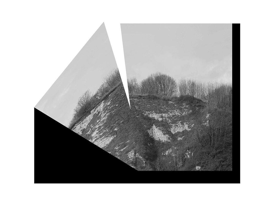


In these photos I can see a landscape picture of nature but the photos have been disrupted in some way. For example, in the photo on the left you can see the image has been split and half of it as at an angle or part of the photo has been taken out, and putting two halves of a different photo into one - expanding the view of the photograph to see more of what's happening in that area. The photo on the right shows a large piece of water and a mountain below, however you can see that the whole photograph is upside down - this is interesting as it makes the viewer look at the landscape photo as they try to figure out what's happening inside of it. The use of cutting out parts of the photo is fascinating as it makes the viewer try to fill in the gaps using their imagination. I also like the colour throughout the photos as Williams has used greyscale but the tone in the images make the photos interesting as on the photo on the right it shows a gradient as the photo gets lighter the further you go down, this leads your eyes to the subject of the photo as it allows you to see more of what's happening the further you go down until you see the mountain in the middle of the photograph. Williams uses texture throughout these photos as in the water you can see the waves and ripples - adding texture and pattern to the photo which makes it stand out more rather than flat land. Furthermore, the snow on the hills adds texture to the plain land, making it more interesting to view. Mandy Williams has made the photographs by taking photos of somewhere in nature and then turning them into black and white. She then disrupts the photo by splitting it up or merging two photographs together to make a new one. I like these photographs because of the minimalistic approach and how simple it is but how interesting the photo is to look at and how the disruptions in the photo change it completely when compared to a regular photo of nature.
My response
To respond to Mandy Williams, I am going to take multiple different pictures of an area and merge them into one photo to give a wider view of an area and also to disrupt the landscape by adding some emptiness into the photo.


Inspired by Mandy Williams - Disrupted Landscapes, I made these photos in photoshop by converting the photos to black and white and then layering them over each other to create a new image through the use of disruption. I decided to show parts of the background as to not cover the entire image with landscape photos to not reveal the image and make the viewer try and fill the gaps in using their imagination. Furthermore, I used multiple photos to show separate locations within one image, showing more information and extending the view of the viewer. I like the photo on the left because of how the tilted angle of the second photograph leaves gaps within the photo - disrupting the image. However the image could have been improved if the original photos showed more of the landscape so you were able to see more of the sky and the grass and outside the photos. The middle photograph is interesting as it shows a tree but with three different photographs, showing three different backgrounds but with the same subject throughout them all. This image uses rule of thirds as each third shows a different landscape. However, it could have been improved if the tree in the middle were lined up throughout the image, making it appear as a seamless transition throughout each photo but still showing the different backgrounds within them. The image on the right shows a landscape photo of a road with trees in the background, I made this by layering two photos of a road over each other with black lines to separate the images giving the effect that they are their own two pictures but within one image. I like how all these photos turned in relation to Mandy Williams disrupted photographs. However they could have been improved by perhaps straying further away from Mandy Williams or making the 3 photos more similar to each other to make them into a triptych.
For the next photo I would like to experiment with taking small parts of one image and laying them out; then disrupting the whole image by covering parts of it.


To make this photo, I first uploaded the photo into photoshop and turned into black and white. I then cut out parts of the photo, carefully choosing important subjects that reflected what the photo was about, showing off the scenery and the nature inside of the landscape. I then placed black shapes over the top of the cut out shapes as to disrupt the photo - hiding pieces of image and choosing what to not show to the viewer. I also coloured the background to a plain white to make the parts of the image stand out more as the contrast between the monotone photos and the white background accentuate the landscape. To finish the image, I then turned down the contrast and increased the brightness as to show more of the nature and the grass and trees as well as decreasing the brightness of the sky to stop it from overpowering the image.
In this photo you can see a landscape photo of nature cut into four pieces spread out over the image with a black shape covering over pieces, hiding parts of the photo. I like this photo because of how it shows parts of the landscape photo but the disruption hides parts of it, making it more interesting to look at. I like the contrast between colours, the white background and the black shapes with dark greys from the photo are fascinating as the white against the black makes the photo stand out more. I also like the use of space as the majority of the photo is the white background, though the bits of nature makes the photo come together as the viewer looks at the four pieces trying to figure out what the original photo looks like, if they were all put together rather than split apart. However, this photo could have been improved if the cut out pieces showed more of the photo, giving the viewer more information about it. In addition, there could have been more colour in the original photo as to make more of a contrast inside the cut out pieces of the photograph.
In this photo you can see a landscape photo of nature cut into four pieces spread out over the image with a black shape covering over pieces, hiding parts of the photo. I like this photo because of how it shows parts of the landscape photo but the disruption hides parts of it, making it more interesting to look at. I like the contrast between colours, the white background and the black shapes with dark greys from the photo are fascinating as the white against the black makes the photo stand out more. I also like the use of space as the majority of the photo is the white background, though the bits of nature makes the photo come together as the viewer looks at the four pieces trying to figure out what the original photo looks like, if they were all put together rather than split apart. However, this photo could have been improved if the cut out pieces showed more of the photo, giving the viewer more information about it. In addition, there could have been more colour in the original photo as to make more of a contrast inside the cut out pieces of the photograph.


Now I am going to try and make photos inspired by Mandy Williams by using lines to split up an image and maybe use two images and overlap them to create a transparent effect.


|
In the photograph you can see a field of grass with some trees in the background of the photo but there are black lines coming from the edges of the image, disrupting the landscape and hiding small parts of it. The black lines uses leading lines to draw the viewers attention to the center of the photo as the lines thin out towards the middle of the photograph, making the viewer look for something inside of the image but the minimalistic photo of the plain fields make them look deeper into the background in the trees and houses. I like how this photo turned out because of how it is very simplistic but the addition of the lines give the viewer something to look at. However I think it could have been improved by adding colour to some parts of the photo such as giving some small sections the original colouring of the photo.
|
In this photo I can see a transparent image of a garden overlapping a picture of a field with black lines running throughout the picture. The image is monochrome and with some transparent houses in the middle of the photo showing through. The use of the black lines helps to seperate the image into different sections, giving the viewer different parts of the image to look at. The black lines also help to show parts of the second image through as the black gives a background for the transparent image to shine through. I like how this photo turned out because it is interesting to look at as it gives the view of two images and two locations but only through one photo.
|
