portrait
/ˈpɔːtreɪt,ˈpɔːtrɪt/
noun
/ˈpɔːtreɪt,ˈpɔːtrɪt/
noun
- a painting, drawing, photograph, or engraving of a person, especially one depicting only the face or head and shoulders.
The first time i saw a portrait was an online photograph and was of a family member. Photography has changed now as it's now better quality and more detail.

Robert Cornelius - Self-portrait, 1839
|
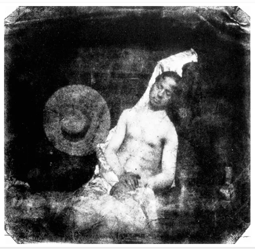
Hippolyte Bayard - Self Portrait as a Drowned Man, 1840
|
One similarity is that they are both self portraits. One difference is that they are different colours, this is because they used different photographic processes. I think the photo of Robert Cornelius is just a photograph of his and head shoulders because that is the main subject of the photo as he was trying to do a self portrait and didn't want to show anything else. In the photograph of Hippolyte Bayard he is laying down because he is posed as his own dead body in a staged suicide, this was known as the first photographic prank. These photographs are portrayed in different ways as Bayard's photo is of his whole body and he is posing in the photo however in Cornelius' photo he is looking at the camera and it is just of the top half of his body. I prefer the photo of Bayard because it is more interesting to look at as it has more stuff in it, also the way the photo has developed makes it more pleasing to look at and has leading lines. If i could ask the photographer a questing i would ask why he did the photo that way.
Genre
A genre in photography is a specific type or category of photos. For example: portraiture, abstract or still life. When doing a specific genre in photography you have to think about what you are taking a photo of and the different colours or angles of the photo. You can also look at other peoples photographs of that genre to get an idea of how to take yours.
Nico Froehlich workshop
These are my favourite photos from the Nico Froehlich - South of the river project.

|
I like this photo because it is very creative as it shows someone inside a basketball hoop. The colours in this photo works well as the the pink rails contrast against the much darker sky making the photo pop out. Nico Froehlich uses leading lines to make your eyes focus on the subject of the image and guide the viewer throughout the image. The lighting is interesting as it gives the image a warmer tone and the shadow of the person helps to elevate the image.
|
|
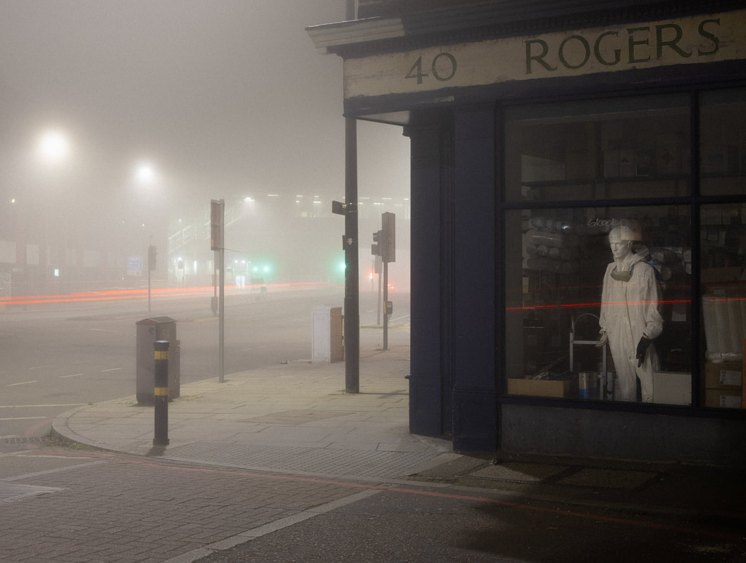
I also like this photograph as the fog makes the image look very mysterious and makes you wonder whats happening in the image. The lighting in the photograph is also interesting and makes it pleasing to look at. The shop also adds a natural framing as it only shows the interesting bits of the photograph. In addition the statue in the shop makes the photo stand out more and makes it more visually appealing as it makes you question the photograph and makes it more interesting to look at.
|
|
|
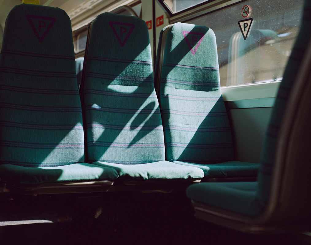
The image on the right is also very nice as the lighting through the windows casts a nice shadow on the chairs, the shadow also compliments the colour of the chairs and makes the image very vibrant. The stripes on the chairs add leading lines and making the colour of the chair pop out .
|
|
This photo is visually pleasing as the yellow in the photo compliments the girl in the centre of the image. The red on the person compliments the yellow background and text on the sign. The shadows in the photo add natural framing and only showing the background and the subject of the photo. The bike also makes the photo look more natural and looks more environmental.
|

|

|
This photo is very nice because the reflection in the water makes the image very symmetrical and is pleasing to look at. The lighting in this photograph is also nice as the natural light coming from the window adds shadow to the background and makes it more interesting.
|
|
This photograph is very nice as the blue on the person and the truck matches, making it visually pleasing to look at. The graffiti on the truck makes the photo look more natural but also more interesting as it isn't all blue, and the grass makes the blue pop out more and catches your eye.
|

|
Environmental portraits - For this task I went around the school taking portraits of people walking around, and thinking about the background and how it will compliment the photo. I also had to think about the composition of the people and if the lighting was to bright and the shadows.


These photos are nice as it doesn't just focus on the person in the photo but also the background and how the lighting compliments it.
These were the most successful photos.


These photos were successful as the lighting in the photo isn't too harsh but still casts nice shadows of the people in the photo. The composition of the photos are also nice as the colours of the subject compliment the background and the sky. The framing in some of the photos are nice as the people are in the centre of the image and the background makes it more interesting to look at.
Self portraits


Reflected Obstructed Symmetry
For this task we had to take self portraits under some categories but got to interpret it how we wanted.


These portraits are very similar. For example, the composition of the images are similar as they both have a window and a bed at the bottom, the people in the portraits are also in the same pose and are reading. The lighting in the images are similar as it comes from the window casting shadows on the creases on the bed and on the person in it.
Some differences in the photo include the curtain on the right side of the painting, they were made in different times and one is a painting and the other one is a photo.
Tom hunter may have been inspired by this image as the lighting in the painting is interesting and the colours in the photo are visually pleasing.
The colours in the painting are different as the photograph is more vibrant and the colours are more harsh but in the painting the colours are more warm and in the photo there are more shadows which makes the overall photograph darker.
Portrait Recreation

|
For this task I had to recreate an old photo, I did this by doing it in the same place as before. I also thought about the clothes i was wearing at the time and what is was doing in the photo.
|

|
Tyler Mitchell
Mitchell's photographs and videos propose a utopian vision of Black beauty, desire, and belonging
Collectively, these moments become figments of an imaginative psychic state if being, one in which radiance, resistance, restraint, comfort, and full human agency exist.
- Tyler Mitchell

|

|

|
These were my favourite photos because they all capture people in their daily lives, having fun. The image on the left is very nice as the colours are pleasing to the eye and it also uses the rule of thirds to capture what he is doing in the photograph. The middle photograph is nice as the contrast between the pink hula hoop, the person and the sky makes the image interesting to look at, also the angle the photograph has been taken at is interesting as it is under the person this makes it look like a raw photos and has been taken out of someones daily life. The image on the right shows someone hovering above water in a swing. This image is very creative and the reflection in the water adds symmetry to the photo and makes it very interesting to look at, and the green in the photos compliment the sky and the water, and also makes the subject of the picture stand out.
Chris Killip


Christopher David Killip was a Manx photographer who worked at Harvard University from 1991 to 2017, as a Professor of Visual and Environmental Studies. Killip is known for his black and white images of people and places especially of Tyneside during the 1980s.
These photos from Chris Killip represent the truth of people's lives, taken in 1973 and 1985. The use of the monochrome makes the photos look miserable and gives all the photos the same feel. By taking these photos he was documenting peoples life without editing them to show peoples lives in that period of time. This showed how people were living and how they felt.
These photos from Chris Killip represent the truth of people's lives, taken in 1973 and 1985. The use of the monochrome makes the photos look miserable and gives all the photos the same feel. By taking these photos he was documenting peoples life without editing them to show peoples lives in that period of time. This showed how people were living and how they felt.


For this task we went outside and took photos inspired by Chris Killip. I did this by taking photos of people and thinking about the background and the expression of the person in the photo. To make the match the style of his, I edited the photo on my phone to make it black and white by turning down the vibrance and saturation of the photo.
Breaking Boundaries
Cindy sherman

|

|

|
Cindy Sherman - Cynthia Morris Sherman is an American artist whose work consists primarily of photographic self-portraits, depicting herself in many different contexts and as various imagined characters. She grew up in Long Islands, New York and enrolled as the state university of New York majoring in painting. Sherman influenced lots of photographers to do portraits but also influenced painters and performance and video artists. Sherman works in series, typically photographing herself in a range of costumes. To create her photographs, Sherman shoots alone in her studio, assuming multiple roles as author, director, make-up artist, hairstylist, wardrobe mistress, and model. Sherman gained popularity taking 'disguised' self portraits that comment on social roles and sexual stereotypes. To take these photos, Cindy Sherman dressed up as a character and used her camera to take the self portrait.
Zanele Muholi

|

|

|
Zanele Muholi is a South African artist and visual activist working in photography, video, and installation. They try to capture the moment without negativity or focusing on the prevalent violence, portraying the LGBTQI community as individuals and as a whole to encourage unity. Zanele Muholi was born and raised in Umlazi, Durban, Kwazulu-Natal. In 2014, they presented at the Design Indaba Conference in Cape Town. Muholi completed an Advanced Photography course at the Market Photo Workshop in Newtown, Johannesburg in 2003, and held their first solo exhibition at the Johannesburg Art Gallery in 2004. Muholi has described themselves as a visual activist as opposed to an artist. hey are dedicated to increasing the visibility of black lesbian, gay, transgender, and intersex people. Zanele Muholi largely draws inspiration from local South African black queer communities, including herself and her friends. Her work is informed by a long history of oppressive colonisation, which lays the structural foundation of how we imagine blackness, the female body, queer sexuality, and representation today.

Viviane Sassen 'Cluster' 2013
|

Vivian Maier New York 1953
|
These photographs are similar as the are both of people and they both use lighting to make the photo interesting to look at. They both use shadows to cover the face of the person in the photograph. These photos are also different as they use different backgrounds, and one uses colour but other is in black and white. They were also taken at different times, and the photograph on the right is a self portrait but the left photo is someone taking the photo of someone else. These photographs have used leading lines to lead your eyes to the subject of the photo and also diagonal lines to create movement and stretch the photo. They also used rule of thirds. The lighting in the photo is very interesting as the shadow covers the persons face but makes it more visually pleasing as the left photograph covers the person face in a blue shadow making the photo stand out. The photograph on the right has half of the person covered in a shadow and the rest in a natural lighting. I think the framing of photograph was staged and took a while to make as they must of had to wait for the shadows and the lighting to be perfect before taking to the photo. The background of the images is interesting because the image on the left uses different shadows to make the photo more attractive and the image on the right incorporates the city to make it more natural and more interesting to look at. The use of colour in the image on the left is nice as it isn't too colourful but the contrast between the blue lighting and green clothes makes the photo very pleasing. The use of black and white on the image on the right is nice as it gives it a more natural look and makes it look old-fashioned which fits with the rest of the photograph. I prefer the image on the left though as the use of colour makes the photo more pleasing to look at and more eye catching.
Recreating famous paintings

|
For this task, we had to try and recreate this painting as close as possible using fabrics and trying out different poses and playing around with the composition to try and match the painting as close as we can.
|


After taking the photos i found that this one was the best as it matches the painting better than the other photos and also the lighting and composition is better than the others.

This was similar to another lesson when i recreated a painting using different facial expressions and playing around with different fabrics and colours to try and match the paintings clothing and style.

|


|
In todays lesson we had a workshop, talking about different lighting and using soft boxes to try out different types of lighting. We also saw how to use a light diffuser to make the lighting softer on the person and make the shadows less harsh and making the photo look more pleasing. We also learnt about different types of lighting such as key light - the main light being used in the photo. Then we tried to recreate some paintings trying out the lights and background.


These photos worked as the posing was very close to the original painting and the lighting was similar to the painting and in the photo on the left we also used a can to try and get as close to the original painting and to try and show the emotion of the character. On the photo on the right we tried to get the angle the same as the photo while still keeping the overhead lighting to shine on top of the person.
Alternative portraits
Rhiannon Adam
|
Rhiannon Adam is a photographic artist. She was born in Co. Cork, Ireland, and attended Central Saint Martins college of Art and Design and the University of Cambridge, where she studied Arts, Design and Environment, and English literature respectively.
|

|
Viviane Sassen

|
Sassen was born in 1972 in Amsterdam, and lives there. Sassen takes portraits of people looking away from the camera and also very vibrant photos with lots going on inside
In this image I can see someone standing with birds flying around him. You can also see the sky and his clothes matching but his bags adding a contrast. |
Responding to Images
|
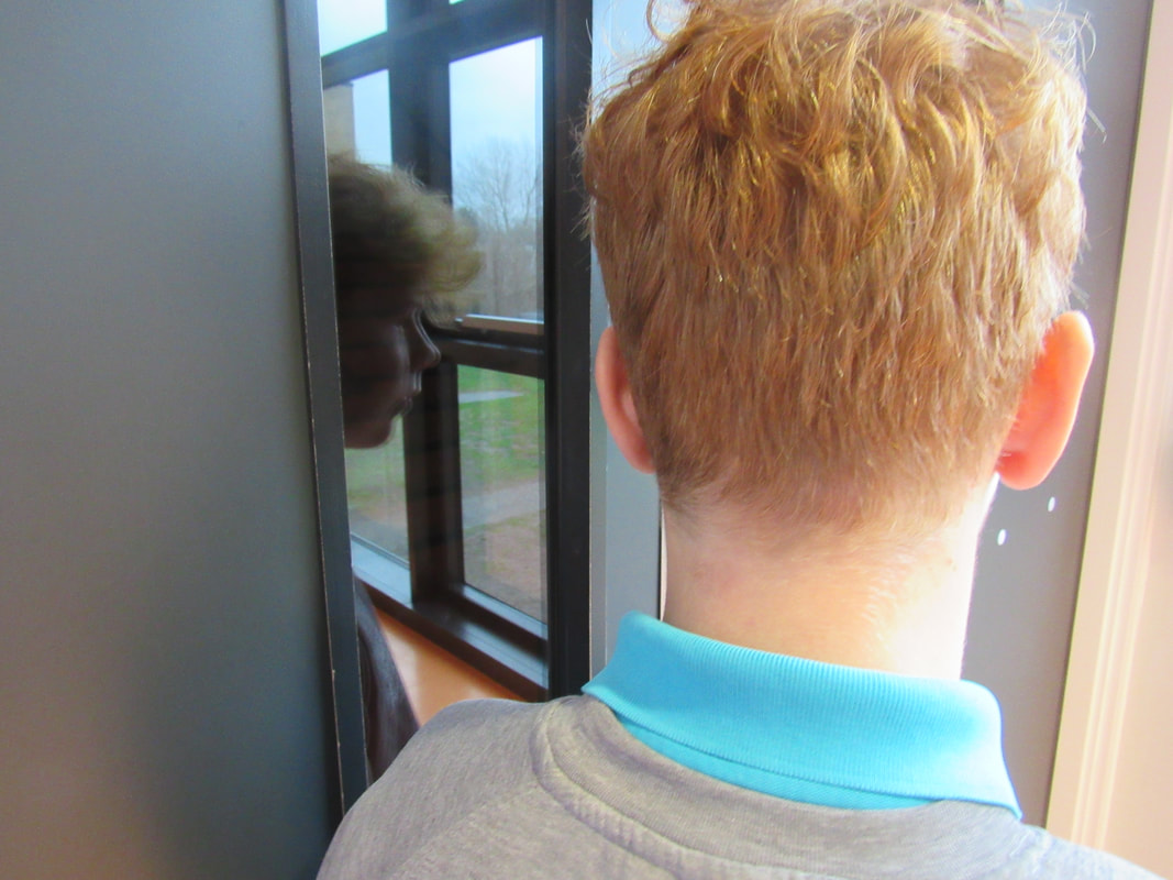
This work is inspired by Rhiannon Adam, I tried to replicate the effect of the reflection in the window but the window was too small to fully capture the effect. It was also hard to capture the lighting as I was using natural lighting which was too bright. If I were to redo this piece I would do it on an actual train and try to pose as closely to the person as I can.
|
|

|
This work is inspired by Viviane Sassen, I tried to take picture outside where you could see the sky but it was hard to do without being high up. I also couldn't replicate the birds and if I were to redo it I would try to pose as the person better and get the colours of the photo more accurate.
|
Manipulating and editing photos


For this task I printed the images in different colours and used them to try and change the original image in interesting ways.
For the first image I printed the photo in orange and used a blue transparent tape to put over it. I then cut the tape in the shape of my head and shifted it to the side to let the orange through.
For the first image I printed the photo in orange and used a blue transparent tape to put over it. I then cut the tape in the shape of my head and shifted it to the side to let the orange through.


For these photos, i played with colour of the image using photoshop. For the photo on the left, i changed the image to red and then copy and pasted myself but changed it to red and blue. For the photo in the middle i changed it to black and white but also cropped out my head and hands to make it look mysterious, then i used gave the image a sky to add some colour to it. For the image on the right, i inverted the colours of the photo but used the history tool and used that on myself.


For these images, I used the filters on photoshop over the top of one photo to see this different outcomes you can get.


These photos worked well as they differentiated from the original photo but you can still tell that they are from the original photo. I like how the colours in the photo changed, giving the image a different mood and changing the whole feeling of it. I also like how some of the photos are blurry which gives a different feel to the photo and makes it more interesting to look at it as it intrigues you as to what is happening inside the photo.
David Hockney


David Hockney makes collages of photos called joiners. He does this by taking many photos at different angles but of the same object and joining them together to make the joiner. He layers all the photographs to make the photo interesting but also to try and remake the original object which makes the final image interesting to look at and makes your eyes look all over the image, unsure what to look at. He also does this with scenery which gives him more creativity to make the shape of the final image and what parts of the scene to put in. We
Photo-joiners
|
For this we took multiple photos of each other using different angles of the person and capturing different parts of the face to make a collage of the photos inspired by David Hockney. We then transferred the photographs to photoshop and layered them over each other to make a try and make a face but by using the different photos and angles of each feature of the face.
|

|
Hannah Lenz


In these photos Hannah Lenz is taking photographs of Else on her 97th birthday. She portrays the different life older people have and also shows Else's apartment in which she has lived in for 58 years with lots of memories attached to everything inside. Hannah uses the bright lighting from the windows to showcase the antique furniture inside the apartment and also to show how Else's daily life is compared to the viewers. The portrait
Julian Germain


These photos of Charlie Snelling showcase his life living alone in a small house in Portsmouth. Germain uses vibrant colours in the photos to portray how Charlies feels and that "Charlie is alone but not lonely, he is surrounded by the things he loves, the photographs of his life with Betty, his colourfully decorated house and his small garden and greenhouse." Charlie lives alone but still enjoys life to the fullest and Germain captures this by showing what he does everyday. Germain also uses a variety of colours to represent how his life is fun, like the photos. In the portraits Germain uses natural lighting to brighten up the focus of the photo while also making the background interesting to look at.
Response


Extended Project
For the photos I will take photos of shops and buildings in my local area thinking about the environmental features around where I live; doing environmental portraiture. I will start this project by looking around my local area to see people or interesting buildings that could be photographed and that capture the interesting aspects of my local area. This project is inspired by the Nico Froehlich project: South of the river, in this project he takes photographs exploring south London and also the local people that live there.He takes photos of: the shops there, the people there, the old buildings and he explores the general mood of the area. When taking the photos he thinks about what the person is doing in the photo or what they are wearing to match it to an environment and also the colours inside the image, this makes the photo stand out and look eye catching. He also uses lighting to alter the photograph and make it more visually pleasing. I will take photos of people in my area and the shops or houses that are local to me.
Nico Froehlich - Inspiration


